↑
Overview
Date
Output
Institution
Role
Aug-Dec '20
Career Foundry
UX/UI (solo)
Tools


Bee Q
In December 2020, I worked on the look and feel for BeeQ. My passion for product consistency led me to create a design system to ensure both consistency and quality for both, the product and the product design experience.


The limitation of pattern libraries
Pattern libraries are usually a big page with the different styles of all UI elements such as different heading sizes, button styles, and the input fields used to build the UI. You can keep all of the smallest elements consistent, but they don’t have any opinion about how to construct them. They don’t know anything about your product and the philosophy behind it.
1
Efficiency and speed
streamline the desing process, and allow rapid prototyping and experimentation
Goals
2
Consistency and user experience
ensure predictable and accessible interfaces which forster trust in users
3
Create a strong brand
weave the identity throughout the product in a consistent and maintanable way
4
Focus on what matters
instead of needlessly creating the same things over and over


How create a Design System?
I reviewed the various digital design systems, i.e. the cohesive platform systems from Apple, Google, and IBM, product-specific systems like the ones from Audi, Uber, and Airbnb.
I noted that the design systems were extremely generic on a component level. Knowing that didn’t have to reinvent the wheel helped me to focus on the interesting and challenging parts - the guiding principles and brand foundations: color, typography, iconography, layout, shapes, elevation, motion, and content.
Brad Frost's Atomic Design Methodology seemed a promising concept for building systems in a logical and structured way on how to assemble these elements into components, and these in turn into an actual product. To understand how this methodology translates into practice, I also interviewed a senior UX designer at Yara Digital Farming.


Benchmark

Content Audit

Accessibility

Principles

Visual Language

Atomic Design

UI Elements

UI Patterns

Documentation
My Approach
Principles
Initially, I translated the perspective BeeQ had on the problem it attempts to solve into principles so that my design system would reflect, refract and reverberate that position.
Principles are the practical, stern, opinionated standards that help guide decisions in a consistent direction. Specific design principles should fit your product perfectly and look awkward on everyone else.
Foundations
Define colors, typography, iconography, the shapes, effects, motion, and content guidelines.
Subtle Anthrazit
# 1F1E23
Bright Blue
# 0217E0
Cheer Lime
# B9EB00
Success Green
# 0AC27B
Alert Red
# DB1C27
(1) The colore palette draws attention to the content through contrasting hues, while functional colors make important statues and alerts stand out.

(2) To build trust and speed up loading times, I chose a system font and defined headings and paragraph styles.


(3) The SF symbols are an extensive set of configurable icons. To ensure inclusivity, I specified when and how to use them. (Essentially: An icon should be understood without thinking.)

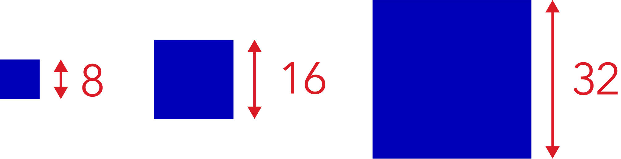
(4) White space is created by multiples of eight which define dimensions, padding, and margins inside (spacing) and between (layout) components.


From the very beginning, I assigned styles to elements, making iterations much easier and keeping the project clean.


(5) To avoid future guesswork, I also defined the shapes, elevation, and motion.
(6) The fact that content appears all over design system components, led me to define parameters for (micro) copy and images.
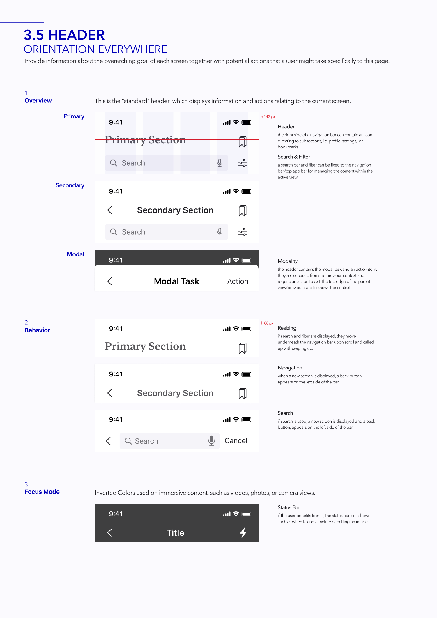
Elements
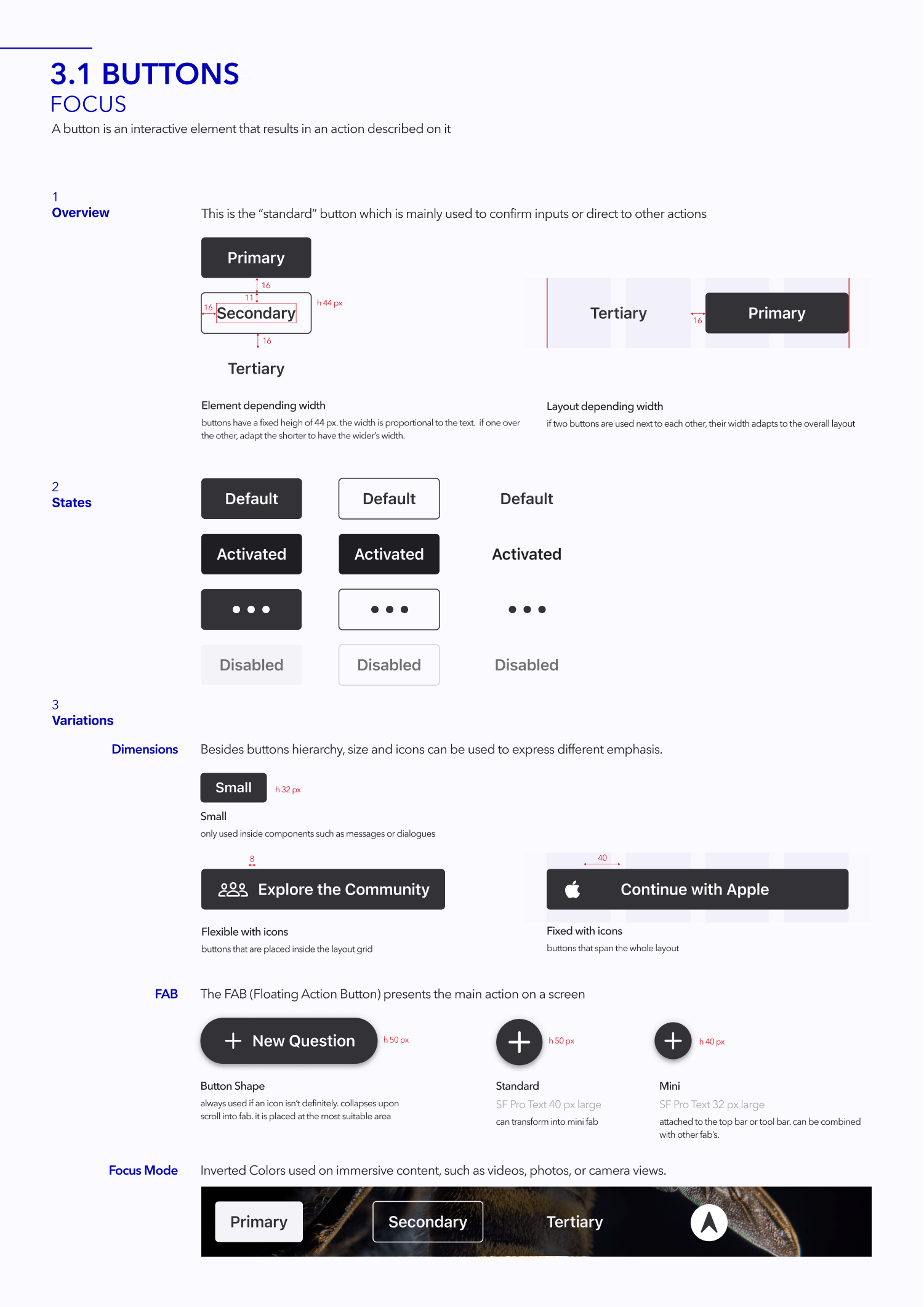
Each element is a combination of the foundations. These elements differentiate into distinctive UI elements, used throughout the product, e.g. buttons or input fields, and patterns as recurring practices such as navigation, search, or dialogs, often containing multiple elements and states (hover, focus, input, activated, disabled, error, success).
Every time I use a certain element more than once, I create a component for it.

Elements
Each element is a combination of the foundations. These elements differentiate into distinctive UI elements, used throughout the product, e.g. buttons or input fields, and patterns as recurring practices such as navigation, search, or dialogs, often containing multiple elements and states (hover, focus, input, activated, disabled, error, success).
Every time I use a certain element more than once, I create a component for it.

To build a scalable design system offering easier component browsing and reduced complexity of instances, I combined base components with nested instances and variants.

I tested patterns through prototyping. Back then it was necessary to create each sequence (like a flipbook) - the beta release, of interactive components (2021) speeds that up by allowing to set default interactions at the component level.
Motion to delight, educate, and focus users are often left out in the discussion but it fits perfectly into the guiding principles behind design systems - repeatability, time savings, and UX consistencies.

Documentation
Good documentation serves to define and communicate visual design, user experience, and technical values, as well as ensure a consistent design, development, and new feature governance process.
The larger design systems I examined for layout inspiration were organized with side navigation, whereas UI kits tend to be organized horizontally, with hundreds of elements on one page.
I decided to add more pages, one for each foundation is (color, text, …) icons, and element group (buttons, input, …), along with a short paragraph guiding all creative thinking behind it, giving context, examples of use and how to apply it.
Scroll that way
01
Hone in my skills. I thoroughly enjoyed this entire project. I got to study some of the best digital design systems and was able to hone my product design skills with libraries, naming and organizing styles and variables, and creating components.
02
My space. When I started this project, I didn't know that what I was going to build was called a design system. I was given two assignments for my UX design certificate - to create a style guide and a design language. Since these tasks felt like duplicate work to me, I decided to combine them. I've unconsciously come up with proven concepts in the past, like Personas, Affinity Diagrams, or the Double Diamond process, and what feels reasonable and natural to me, just proves that I'm in the right space.
03
Do what I love. The design system I created has attracted a lot of attention - it's even earned me job offers- and earning a living doing what you love is certainly a dream come true!
04
Progress. As I re-evaluate the system I designed it itches me to further optimize the component hierarchy. This is indeed the true nature of a design system - an ever improving, always evolving product.
Retrospective

