↑
Tools


Bee Q
A social platform to catalyze beekeeping experiences: the result of my UX design studies. By merging zeitgeist with technology, BeeQ connects experienced beekeepers (>55, rural) with the next generation (<40, urban).


The Problem
The bee is threatened by rural monocultures and pesticides and its awareness is endangered by a declining, aging beekeeping guild. To their delight, urban beekeeping begins to interest a younger generation - and cities are a healthier environment for bees. But the novice beekeeper does not always understand proper care, resulting in die-offs and uncontrolled swarming. As access to the "wisdom" of experienced beekeepers was already challenging in our urbanized society, it became an obstacle with the social isolation caused by c19.
1
Design a user-friendly application
to discover, connect, communicate and solve problems together.
Goals
2
Create an inclusive environment
Acknowledge the significant age difference of the two audience tiers.
3
Design for the context
Consider various environments, seasons, and emotional states.
4
Ensure authenticity and consistency
Provide a reasonable design system and documentation
Late Sign Up
Allow users to try the BeeQ, communicating benefit-oriented and on-context (permission, dialogues, empty states) on how the app answers their needs so that they understand the app by using it and get more hooked.


Community
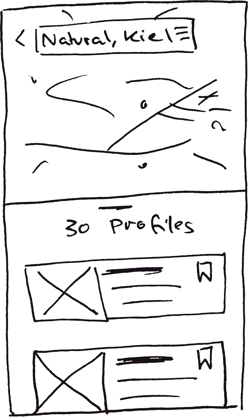
Presenting everything available, displaying the result count for applied filters to let users easily narrow down the choice and find what they are looking for.


Chat
Support users to unambiguously show, clarify, and explain by providing an intuitive way to take, upload, and annotate images.


Question & Advice
Designing an Q&A where a user gets matching suggestions for text- and image-based search queries, alongside an option to publish a new question and donate for helpful advices.


Account Creation
Designing an flexible set of steps that can capture the amount of data the user feels comfortable submitting – while leaving the door ajar for a user to skip at any time to empower users.


The Brief
„Design an app at enables anyone, anywhere to instantly chat with an expert in virtually any field”.

Macroenvironment

Market Research

User Research

Persona

User Journey

Experience Strategy

Flow Charts

Sitemap

Wireframes

Usability Test

Design System

Design Feedback
My Approach
Macroenvironment
Macro trends are an increased interest in responsible living and artisanal skills, reinforced by the the global pandemic. But there is frustration: "you can't google experience!“ Access to expert wisdom* is difficult in our individualized urban society - if not prevented by social isolation brought by c19.
A market segmentation of artisanal skills revealed a lack of expert advice, especially for those characterized by continuous engagement, such as beekeeping, which manifested as a promising use case for knowledge transfer:
* knowledge, understanding, common sense, and insight

€ 500 B
economic value pollinating of 70% crops

1/4
Since ‘85 due to monoculture & pesticide use

55 +
decreasing & aging profession

novice care: die-offs & uncontrolled swarming

130 K
Members in German Beekeeping Association

870 K
Ø 6,5 colonies
per beekeeper

healthier (biodiversity) &
booming urban beekeeping
Competitor Analysis
For the 99% amateur beekeepers there are hardly any offer: Innovative players - networks of beekeepers and designers - stimulate beekeeping with new technologies. But beekeeping apps appeal mostly to the 1% professional beekeepers with smart hive services, or citizens for awareness.
No age-inclusivity: the outdated design of the beekeeper online communities is unattractive to the next generation of beekeepers & the new expert apps are hip on the outside but not user-friendly (yet)


Competitor research as I’ve done many times – new was the UX analysis. With no benchmark identified, I analyzed other apps regarding the functionalities to identify best practices, starting at apps my interviewees mentioned.
User Interviews
Discussing behavior and needs around beekeeping, knowledge transfer, and digital with beekeepers and aspiring ones between 30 and 71 revealed:
-
Elderly are less tech-savvy but used to basic functions: calls, messages, and take, send, and get images.
-
Visual is key: all ages document visually, want to view or show a problem
-
Beekeeping is an activity of academics, used to educate themselves
-
Payment is perceived as inadequate - while beekeepers feel to receive a healthier nature in return, novices still want to express their gratitude
-
Advice-seekers wish direct feedback but are afraid to annoy. Advice-givers respond promptly if possible.
-
Beekeeping varies locally


Extracting insights from 6 user interviews with empathy and affinity mapping
User Personas
Caspar, the curious expert
wants to pass his knowledge - he feels responsible to carry on beekeeping to maintain a functioning environment.
Noémie, the self-actualizer
wants to connect with experienced beekeepers - with no bees in everyday life beekeeping feels too complex to teach it herself.
Jacob, the over-thinker
wants to ensure his bees are healthy - besides knowing the basics he lacks common sense and feels easily overwhelmed.


User Personas are a helpful artifact for user-centered design - but today I know about their tendency to reinforce stereotypes and biases. Hence I prefer to use other methods, i.e. the job to be done framework
User Journeys
Identify essential features for my personas to achieve their goals, alongside opportunities

GPS integration

Search on runtime

In chat scheduling

Zoom

Calculate Waiting Time

Direct editing

ML Suggestions

Visual Search


Identify Opportunities: Users are nervous when they publish a problem. Feedback on when they can expect advice reduces perceived waiting time AND they can distract themselves with other tasks.
Flow Charts
These exercises founded ideation and prioritization.
I explored what else features my personas need and how they would navigate them, when accomplishing their goals.


Sitemap
The primary navigation represents my personas' key actions: Inform, Ask & Advice, Discover, Communicate.


An open card sort, with synonyms and non-parallel structures to prevent keyword matching, validated the initial sitemap - which was only later challenged and enhanced.
Onboarding Strategy
User research revealed that seniors prefer learning by doing & juniors skip explanations. I planned how new users understand what BeeQ does, how to integrate it, and the benefits from this, by using it.


Wireframing
I quickly progressed ideas on how to turn abstract concepts into tangible experiences. With a notion of the layout, I progressively improved fidelity. To not blindly mocking up the design, and to make sure it worked, I created UX copy that accounts for the right space and used realistic images.


Floating labels look great - but are bad for low vision. Icons use minimal space - but understanding differs between seniors and social media-savvy Gen X-Z.


When searching for a beekeeper, a map helps to orientate. When searching visually, suggestions must be comparable. Close-ups are not always possible, so let users zoom in.


Wireframing
I quickly progressed ideas on how to turn abstract concepts into tangible experiences. With a notion of the layout, I progressively improved fidelity. To not blindly mocking up the design, and to make sure it worked, I created UX copy that accounts for the right space and used realistic images.
When searching for a beekeeper, a map helps to orientate
When searching visually, suggestions must be comparable.
Close-ups are not always possible, so let users zoom in.
Floating labels look great - but are bad for low vision.
Icons use minimal space - but understanding differs between seniors and social media-savvy Gen X-Z.
Prototyping
I constantly linked frames to test my decisions
-
Applying filter on runtime confuses on mobile: show all filters at a glance.
-
Any advice must be linked to its questions to understand it
-
Messages and calls are the elements of an entire conversation
-
When does a user need which options to write a message/annotate a picture?

Usability Testing
Remote user tests with 6 participants of 60 minutes each. From the tests, I learned that they understood the rationale for sign up, located all the features, & enjoyed the chat

Script: Questions and scenarios aligned with the goals of my personas with a task flow to see how reality matches my hypotheses.


Affinity Mapping and the Rainbow Sheet: isolated core observations and categorized them into behaviors, ideas, errors, and quotes.

Evaluation: Errors (Error Severity Rating Scale, Jacob Nielsen) and Satisfaction (task level, SEQ & test level - NPS)
Iterations
Testing undoubtedly uncovered some usability issues. The SEQ score for Task 4 "Compare advice and ask a question" of 5.8 identified which fixes had the greatest impact on the overall experience.
Subtle, effective visual updates: the Q&A lightbulb icon next to the title on the home page - a tiny change, but one that should help users make the association it creates.


Preference Test
Users were uncertain what to expect from the launch screen - but loved the image. I evaluated the redesign and the general design strategy - from the outcome I could infer the amount of text, image sizes, design elements.
32 Participants; 20 from Germany and 7 from the US. Among Android users, the light version has a slightly higher approval.
simple, emotional
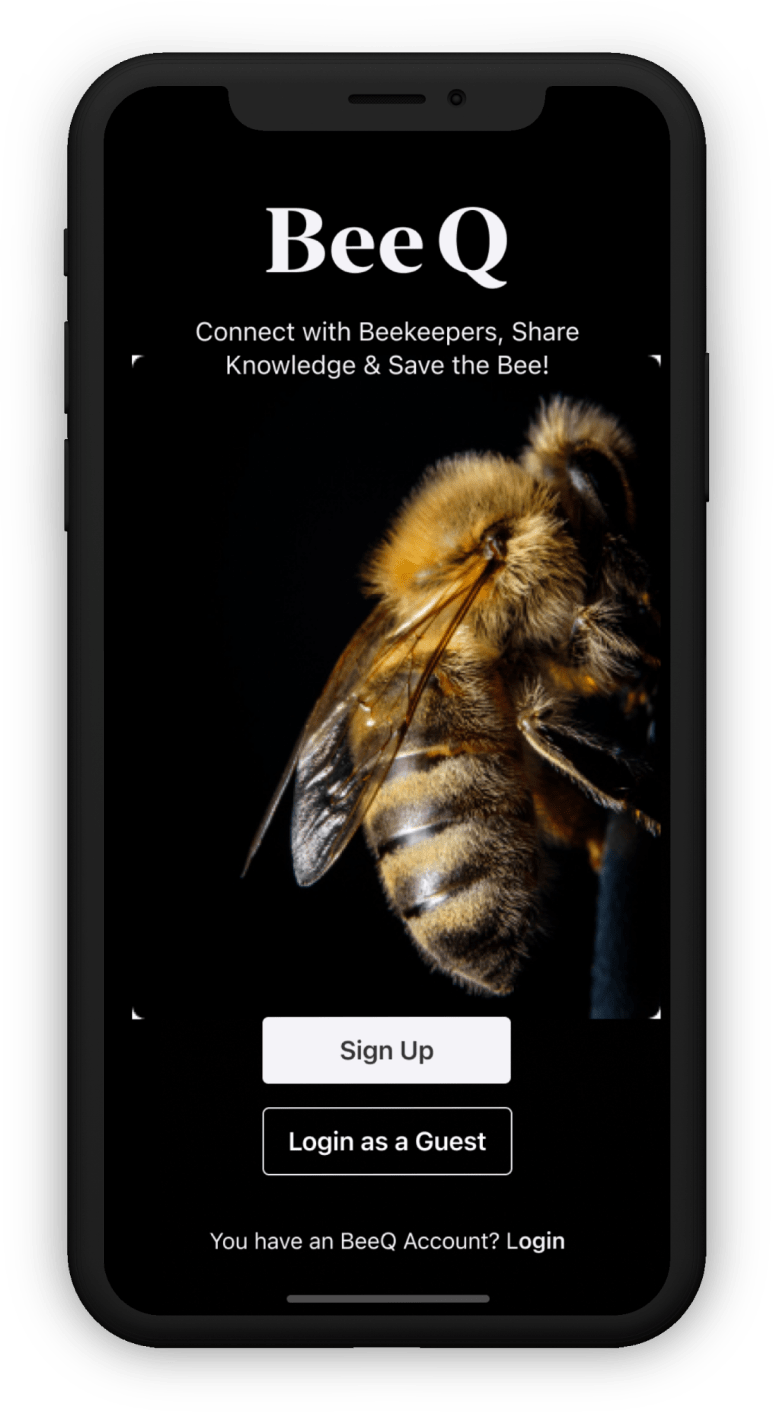

structured, informative
Iterations
Testing undoubtedly uncovered some usability issues. The SEQ score for Task 4 "Compare advice and ask a question" of 5.8 identified which fixes had the greatest impact on the overall experience.
Subtle, effective visual updates: the Q&A lightbulb icon next to the title on the home page - a tiny change, but one that should help users make the association it creates.
32 Participants; 20 from Germany and 7 from the US. Among Android users, the light version has a slightly higher approval.
Preference Test
Users were uncertain what to expect from the launch screen - but loved the image. I evaluated the redesign and the general design strategy - from the outcome I could infer the amount of text, image sizes, design elements.
simple, emotional
structured, informative
Design System
Rationales are based on user and market research, usability tests, and design system best practices.
-
Differentiate from beekeeping online communities to avoid negative associations, with a journalistic touch, corresponding to my target group's media preferences
-
Reduce the learning curve by using familiar patterns and system fonts - which also improves readability
-
Shift the focus to the visuals - working with real content helped develop a color palette that contrasts with the brownish-yellowish user content (WCAG Accessibility Guidelines AA+ Compliant)


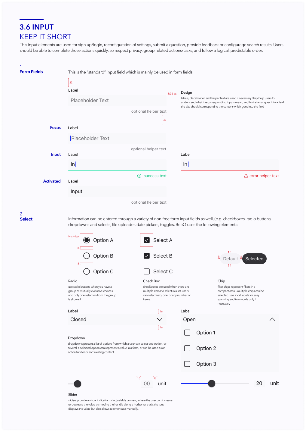
A Figma-based Design System: Principles, Visual Language, pattern and component library alongside usage guidelines and documentation.

01
Obstacles: remote interviews and testing, instead of ethnographic field studies. I needed to consider elderly familiar with devices but not with concepts such as screen sharing. With more time, I’d have optimized a tablet version and designed for scaled UI.
02
Process: This project came out of a bootcamp in a given series of steps. Choosing the methods according to needs of my project could have opened up understanding and exploring. But I am also so grateful for the constant support from my Tutor Paul and my Mentor Vlad who could always add another point of view.
03
Experience and appreciation of design: With a background in physical product design I know that look and feel is just as important as the fit and that a prototype needs to mimic the content (fabric) – and a solid understanding of design theory and concepts helped in developing the UI.
04
Multidisciplinary background: From fashion design to marketing strategy to business management – amazing how much I built upon my skills and experience, and how much analogies I made to understand. I Validated my own enthusiasm for research and connecting the dots.
05
5 month = much time. But besides the project I
-
Worked on a (paid) side project
-
Did heuristic analysis and content audits
-
Discussed the ethics of research and design
-
Analyzed user experience in history and everyday day products
-
Elaborated on human needs and motivation
-
Reviewed design methodologies and frameworks and when to select or mix which
-
Learned about design research methods and how to decide for which
Retrospective


